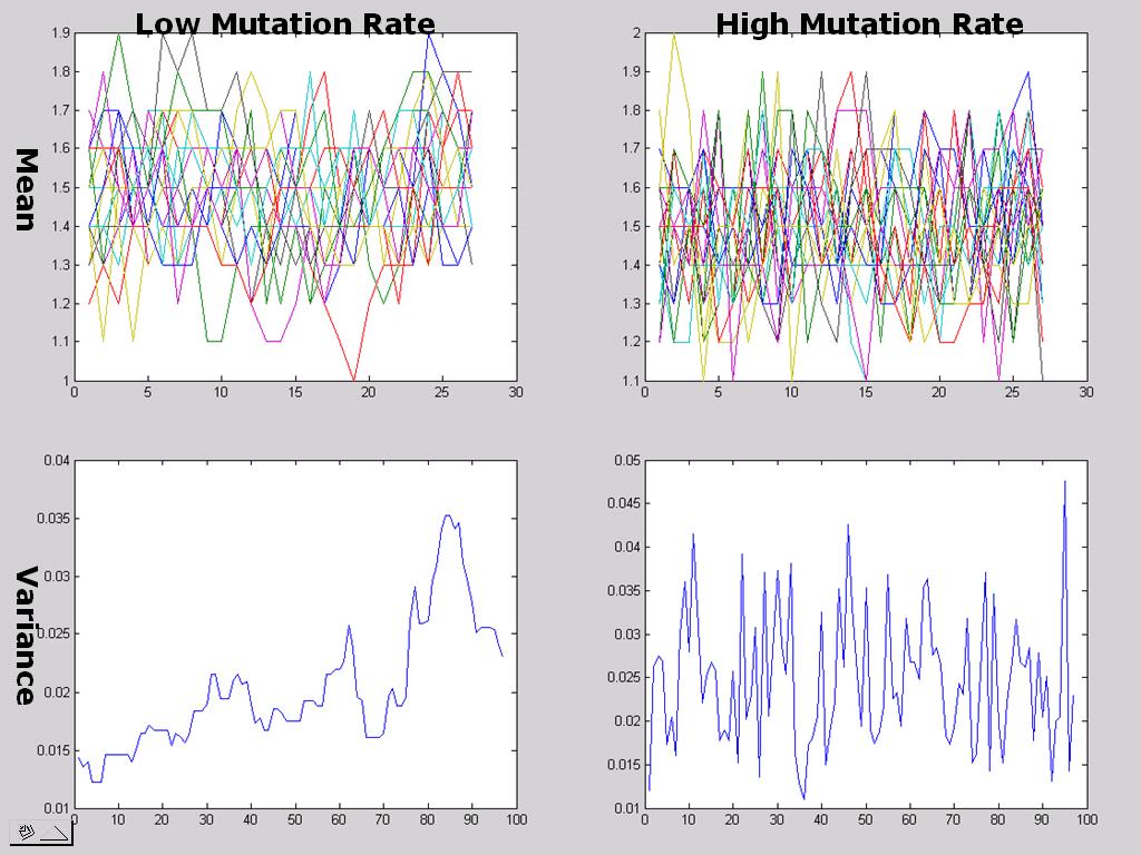
The top graphs plot the mean speeds of the 20 racers over 10 period intervals. As expected, higher mutation rates lead to more volatile speed strategies. The bottom graphs highlight the same point, and are much more pleasant to the eye.